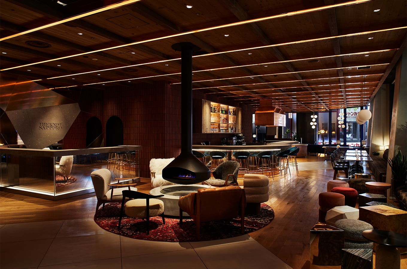
THE KNOT SAPPORO
Symbol of Fusion


Freeform Visual Identity into FUSION
We were responsible for THE KNOT SAPPORO’s design development, from the visual identity (VI) to hotel application tools. In addition to its unique geography where nature and city meet, Sapporo supports the Ainu culture, Meiji era pioneers, and a history of accepting and developing various cultures. Nature & city, human & human, and history & culture come together into a FUSION. We distilled the essence of the city into the design concept, “THE FUSION” and developed a logotype that can freely shuffle and transform. The stenciled letters transform into new visuals as each letter in “THE KNOT” and “SAPPORO” is broken down and reconfigured.
Client: Ichigo Inc. / Collab: Tosaken inc.

Logotype


Logotype Reconfiguration
—FUSION—


Structure

Typeface Design

Color Scheme

Color Scheme —Combination—


Building the Brand Worldview
through Various Scenes
THE KNOT SAPPORO’s logotype extends into the hotel artwork and signage, stationery, and various other scenes. The design blends and transforms, which allows the brand to unify its image while expressing their unique worldview.


More Works
-

Analog Market
Analog Stimulating the Senses
-
Okamura Grand Fair 2022
Heart Beat Office
-
Audio-Technica Excellence
Authenticity in Sound
-
Hunter Mountain
The Story Will Revitalize
-
THE Millennials
Next Generation Hotel Experience
-
LIGARE
Fitness With Visible Evidence
-
NAVISION
A Surprise Yet To Be Experienced
-
PanfixTM
Japanese Brand Expansion to Asia
-
Analogue Foundation
The Future is Analogue
-
Audio-Technica
Innovation with History
-
N.O.U
Creating Future Healthy Habits
-
Japan Media Arts
Distributed MuseumAn cultural journey through the arts


