Audio-Technica
Innovation with History


Succeeding History and Tradition,
Redeveloping the Corporate Identity with a Mindset for the Future
Japan’s leading audio technology producer, Audio-Technica’s corporate identity (CI) was developed in 1962. From the mind identity to the corporate logomark and product packaging derived from the visual identity, we took charge of this diverse yet integrative branding.
Client: Audio Technica

We developed the corporate identity by organizing, then visualizing this brand’s wide range of business activities from PR advertisements and events for segmented products, to variations to spread to all international branches.
Refining the Heart of the Brand, and Delivering to the Rest
The discussion over the brand identity has accumulated countless hours not only in Japan but also at other international branches including NY. Reanalyzing the layers of brand history allowed for a new mindset and values that eventually led to a new identity system in order to deliver the principles of what Audio-Technica stands for (Vision, Mission, Slogan) to those familiar to the brand.

The Logomark Passed on Through the Years —
Evolving as the Epitome of Japanese Craftsmanship and Beauty
The logomark has gone through many revisions since establishment. We respected the weight the historical symbol has upheld through the years, while adding a new element of innovation and elaboration captured in Japanese craft and sense of beauty

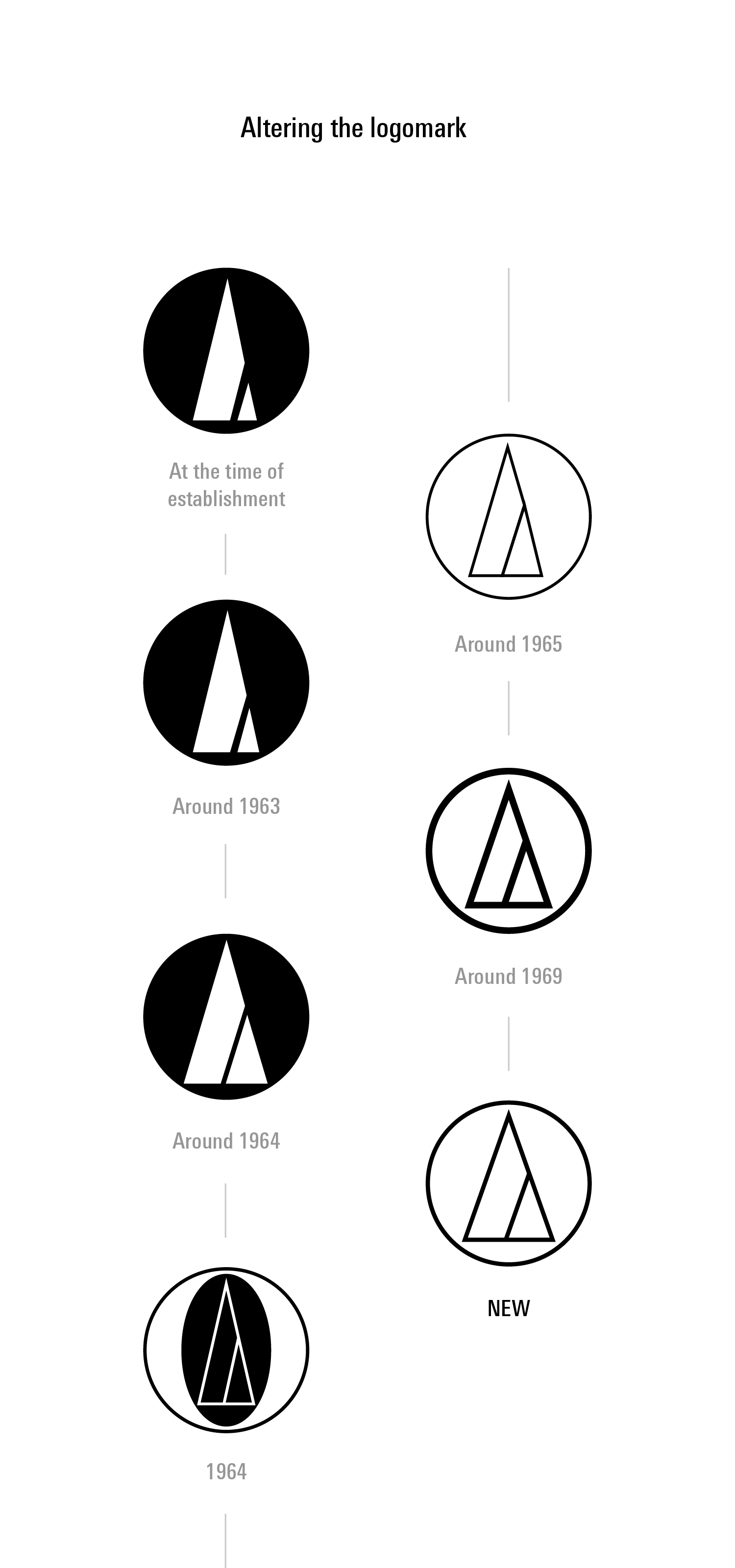
Developing a mark that upholds the original form inherited since the time of establishment
Focus on the Concise and Detailed
Having a wide range of business activities naturally leads to diversifying brand communication. However, this constantly puts the brand in a difficult position to streamline a clear voice. Being the most straightforward communication method, the logomark was put through layers of exploration.
Designing the ideal balance through explorations preparing for any and all possibilities


Symbol development using the Yamato ratio (Silver Ratio) used in Japan since ancient times.


The New and Accurate Placement for the Brand’s Face
The logo catches the most eyes out of any brand communication method, which starts with the product ranging from digital to physical reality. We explored every imaginable placement method and sizing to establish the ideal guideline. With the addition of a new logomark and logotype that can each stand as individual entities, it became possible to respond to any situation with the most effective solution.


Developing the Universal Brand Guideline
We developed a centralized brand guideline that employees of every respective country can understand and use to clearly communicate Audio-Technica’s brand image all around the
world.
It covers logo usage methods for the brand’s mind and visual identity, as well as its advertisements, exhibition events, storefronts, and an assortment of other customer touchpoints. With the completion of this guideline, the
brand has a new unified brand image to communicate globally.


White is the primary brand color alongside a monotone scheme.


Package Design that Balances the Product’s Alluring
Features and the Brand’s Worldview
Audio-Technica has countless products and for each just as much packaging. We explored how to balance the brand with each product’s individuality and created the brand’s flagship model for packaging. This has become the foundation for all following product packaging.


Global Stationery Design
From business cards to envelopes, we created a universal design for stationery. With a design that focuses on the product with elaboration and accuracy, we want to showcase the brand in physical communication as well. Basic stationery rules are all explained in the brand guidelines, which every country can use as a tool to design as necessary.


More Works
-

Analog Market
Analog Stimulating the Senses
-
Okamura Grand Fair 2022
Heart Beat Office
-
Audio-Technica Excellence
Authenticity in Sound
-
Hunter Mountain
The Story Will Revitalize
-
THE Millennials
Next Generation Hotel Experience
-
LIGARE
Fitness With Visible Evidence
-
NAVISION
A Surprise Yet To Be Experienced
-
PanfixTM
Japanese Brand Expansion to Asia
-
Analogue Foundation
The Future is Analogue
-
Audio-Technica
Innovation with History
-
N.O.U
Creating Future Healthy Habits
-
Japan Media Arts
Distributed MuseumAn cultural journey through the arts


