LIGARE
Fitness With Visible Evidence

Creating a New Style of Fitness Brand
from a Medical and Sports Dual Approach
LIGARE is one of few fitness brands in Japan providing sports medicine based exercise menus staffed by those with both a National Medical Practiotioners Qualification and a Personal Trainer Qualification. Medical fitness—an integration between medicine and fitness—is a new fitness style in the spotlight parallel with the recent rise in health consciousness. For LIGARE to reach a wider audience, we created a holistic brand from the creative strategy to brand identity, catchphrase, and website.
Client: LIGARE Medical Fitness
Visualizing the Core Potential to
Maximize Brand Value
A fresh experience comes with the integration of medicine and fitness, core elements of the brand and market differentiation. We thought that articulating this benefit directly connects to brand value maximization. For this reason, we strongly connected the brand with medical fitness in the creative strategy.

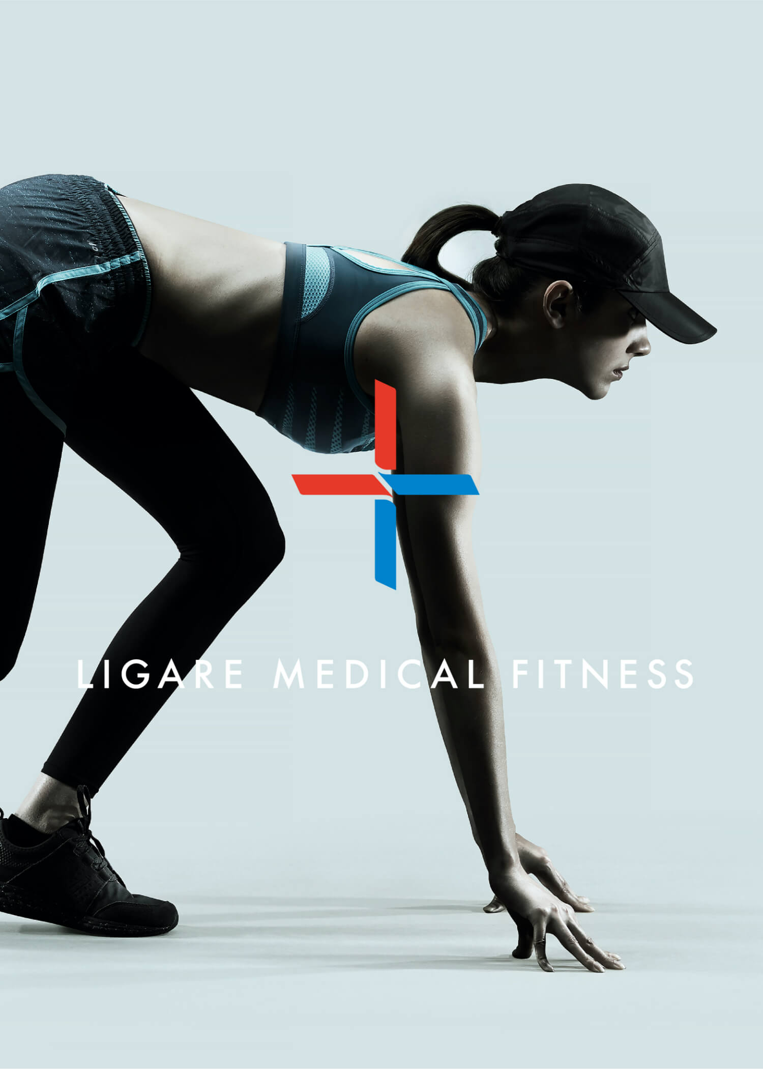
Creating a Memorable Brand Symbol
Representing
A New Fitness Style
We developed a memorable brand symbol that holistically represents medicine and fitness. It stands as a symbol mark that portrays a new style overlaying the principles of medicine and fitness.


Subconsciously Illustrating Two Concepts
Medicine symbolized by red and fitness symbolized by blue. The visual combination of two colors subconsciously communicates the combination of two concepts.
Storytelling Through a Layout Evocative of Medicine
By duplicating the brand’s initial, “L”, into a cross, we achieved a design evocative of medicine. At the same time, this is representative of the connection+ (plus) between medicine and fitness.


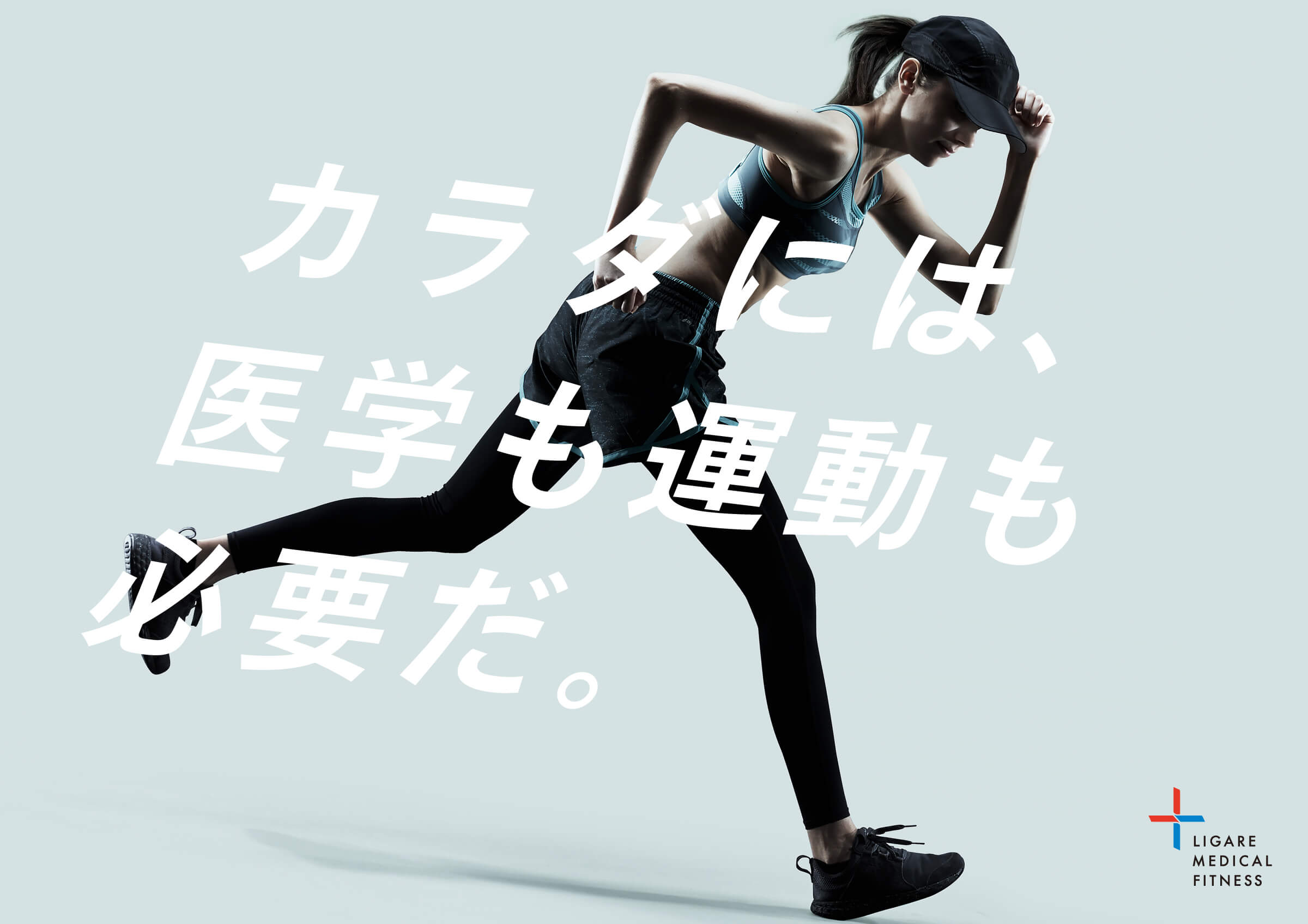
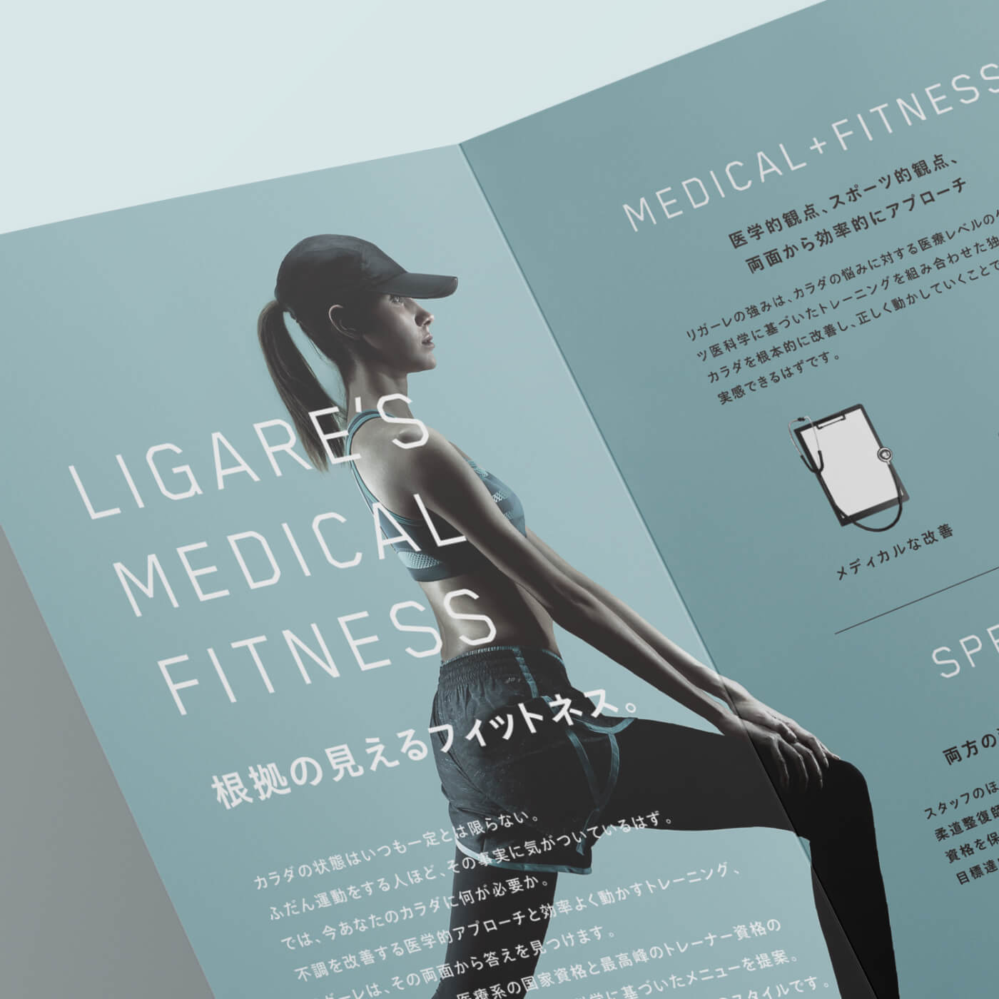
Trustworthy and Actively Beautiful Brand Ideology
We developed a fresh fitness brand ideology with visuals highlighting the trust rooted in medicine and the beauty of a human body.


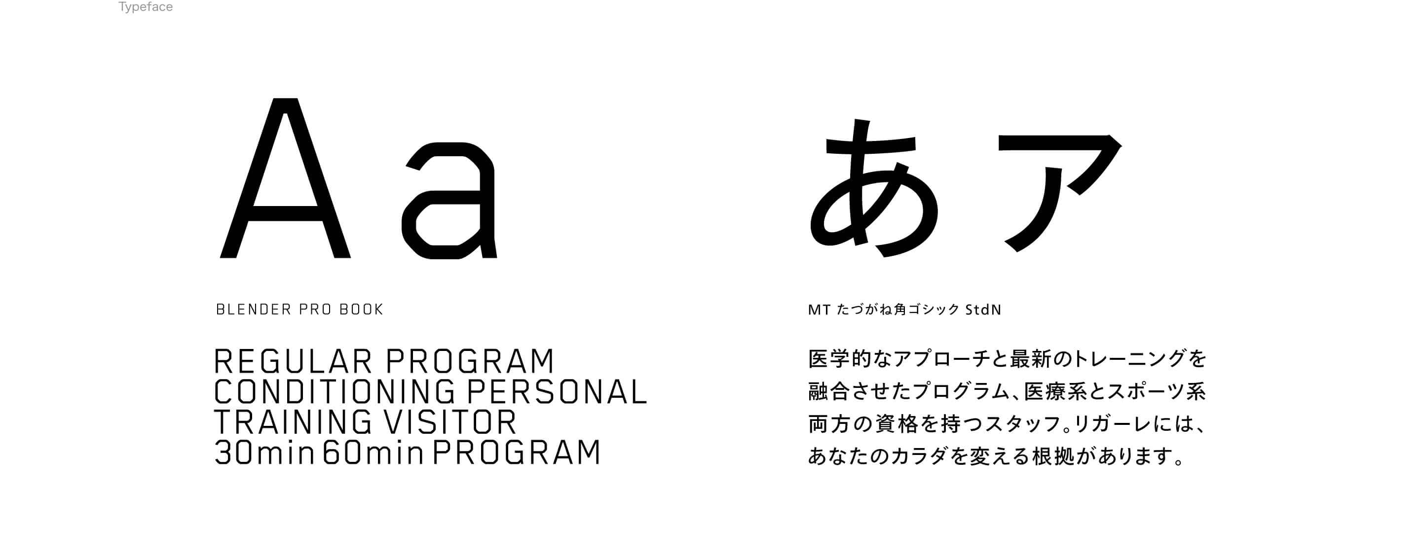
Authentic Words Conveying Benefits
Copywriting displaying authenticity allows for users to easily grasp the benefits of the integration of medicine and fitness.


Effectively Promoting Brand Value
At Various Touchpoints
While taking advantage of each touchpoint’s characteristics from website to leaflet, we created promotions that effectively communicate brand value. These were intentionally designed for users to easily understand the brand ideology and benefits.
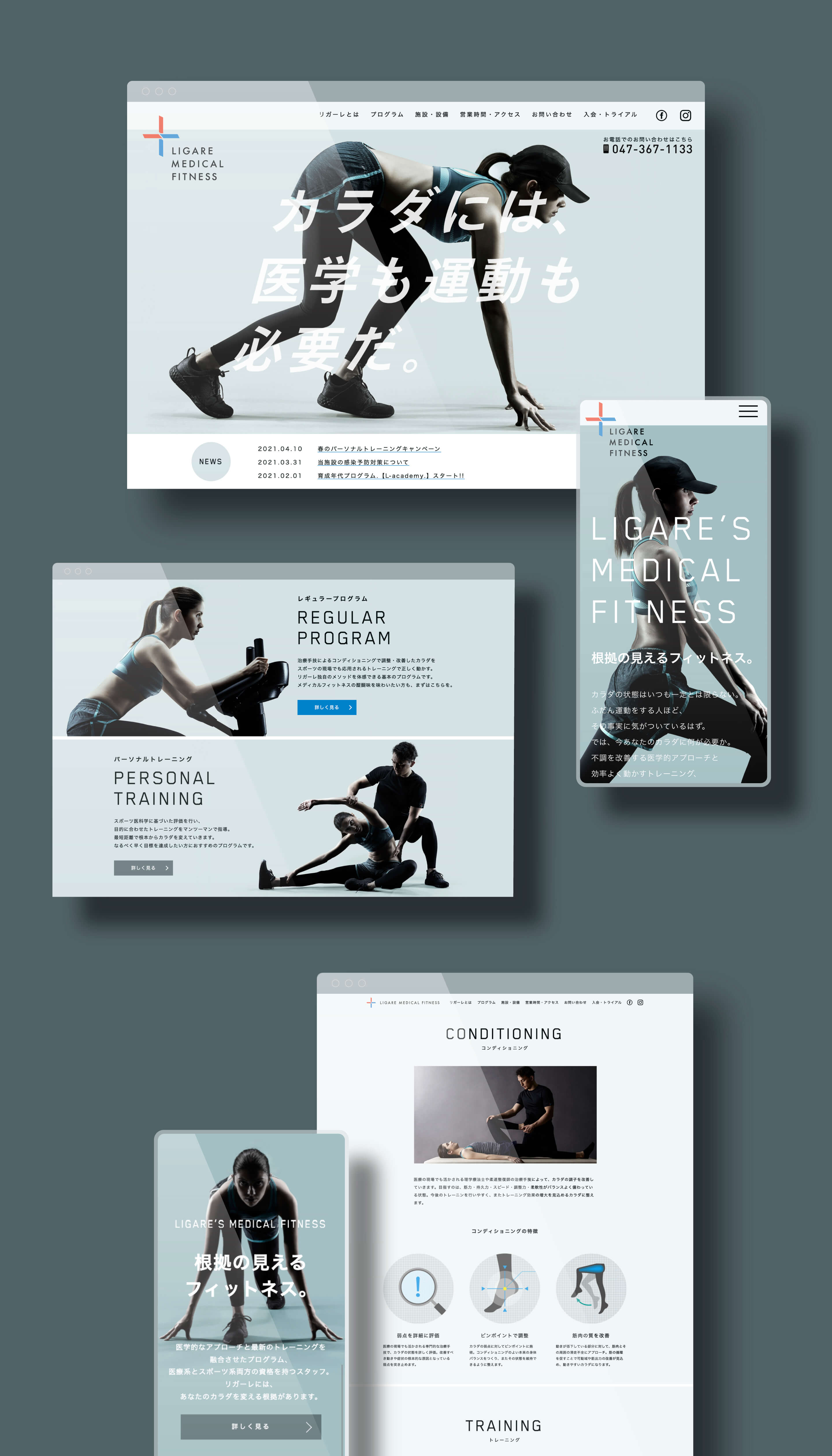

The website is built to communicate the balance between the visual beauty of the brand and effortless content comprehension.

By introducing medical fitness specific knowledge, users relate it to doctor endorsement and we successfully differentiate the brand from generic fitness.


We created illustrative icons that articulate characteristics of the brand to create seamless communication between user and brand.


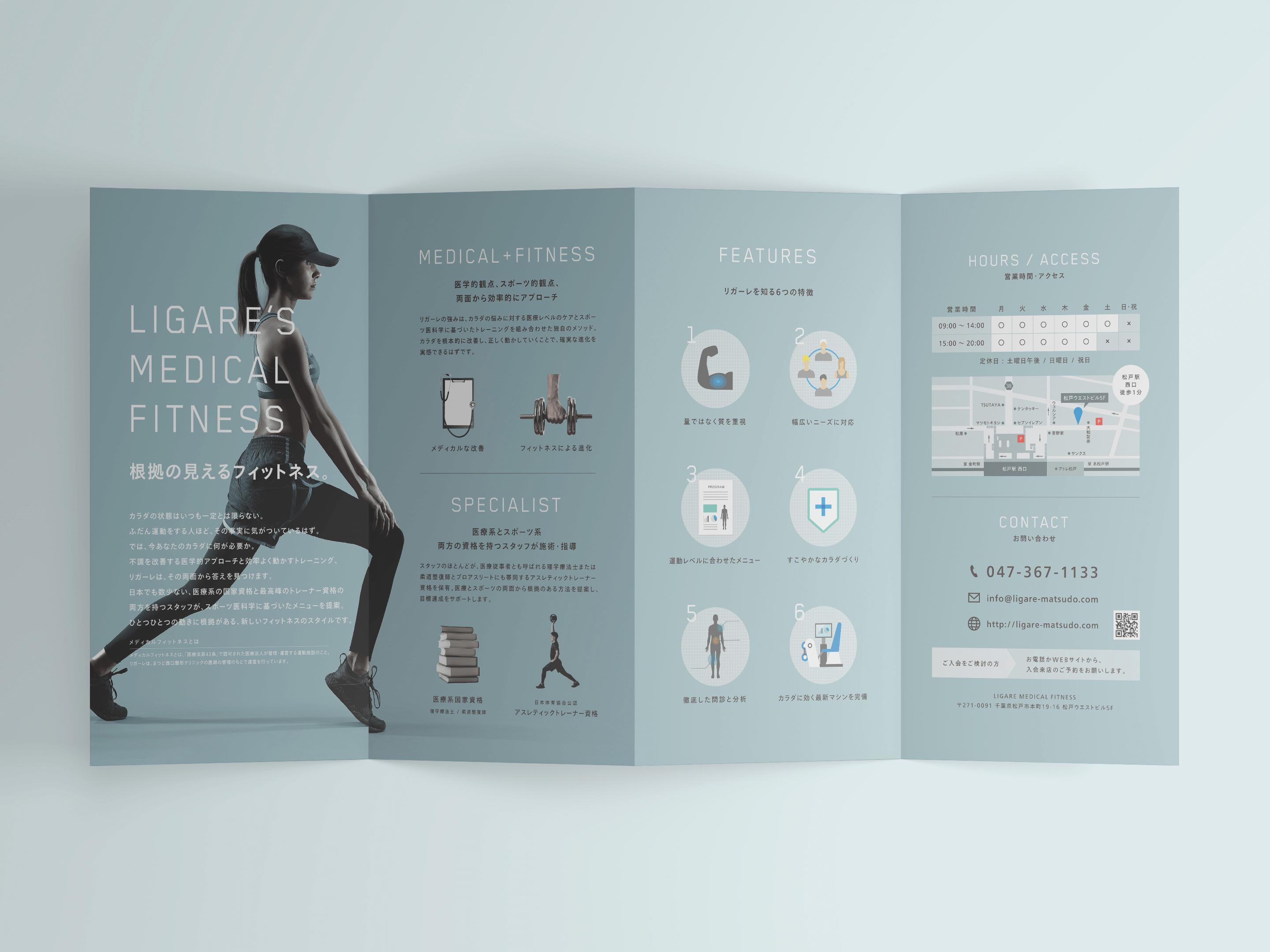
Composed of succinct information, the leaflet conveys the brand ideology and benefits.


More Works
-

Analog Market
Analog Stimulating the Senses
-
Okamura Grand Fair 2022
Heart Beat Office
-
Audio-Technica Excellence
Authenticity in Sound
-
Hunter Mountain
The Story Will Revitalize
-
THE Millennials
Next Generation Hotel Experience
-
LIGARE
Fitness With Visible Evidence
-
NAVISION
A Surprise Yet To Be Experienced
-
PanfixTM
Japanese Brand Expansion to Asia
-
Analogue Foundation
The Future is Analogue
-
Audio-Technica
Innovation with History
-
N.O.U
Creating Future Healthy Habits
-
Japan Media Arts
Distributed MuseumAn cultural journey through the arts


